Tkinter 8.5 reference: a GUI for Python |  |
Designing with ttk widgets involves three levels of abstraction:
A theme is a complete “look and feel,” customizing the appearance of all the widgets.
A style is the description of the appearance of one kind of widget. Each theme comes with a predefined set of styles, but you can customize the built-in styles or create your own new styles.
The phrase “kind of widget” in the
previous paragraph technically refers to the
“class” of a widget. However, in the
ttk world, this is different from Python classes.
Within ttk, the class of a widget is a character
string. For example, the ttk class of a stock
Button widget is the string 'TButton'.
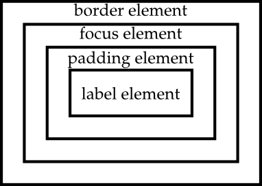
Each style is composed of one or more elements. For example, the style of a typical button has four elements: a border around the outside; a focus element that changes color when the widget has input focus; a padding element; and the button's label (text, image, or both).

We will discuss the discovery, use and customization of each of these layers in separate sections.