Tkinter 8.5 reference: a GUI for Python |  |
Tkinter 8.5 reference: a GUI for Python | |
The Spinbox widget allows the user to select
values from a given set. The values may be a range of
numbers, or a fixed set of strings.
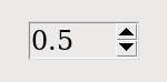
On the screen, a Spinbox has an area for
displaying the current values, and a pair of arrowheads.
The user can click the upward-pointing arrowhead to advance the value to the next higher value in sequence. If the value is already at maximum, you can set up the widget, if you wish, so that the new value will wrap around to the lowest value.
The user can click the downward-pointing arrowhead to advance the value to the next lower value in sequence. This arrow may also be configured to wrap around, so that if the current value is the lowest, clicking on the down-arrow will display the highest value.
The user can also enter values directly, treating the
widget as if it were an Entry. The user
can move the focus to the widget (see Section 53, “Focus: routing keyboard input”), either by clicking on it or by
using tab or shift-tab, and then edit the displayed value.
To create a new Spinbox widget as the
child of a root window or frame parent
w= tk.Spinbox(parent,option, ...)
The constructor returns the new Spinbox
widget. Options include:
Table 32. Spinbox widget options
activebackground
| Background color when the cursor is over the widget; see Section 5.3, “Colors”. |
bg or background
| Background color of the widget. |
bd or borderwidth
| Width of the border around the widget; see Section 5.1, “Dimensions”. The default value is one pixel. |
buttonbackground
| The background color displayed on the arrowheads. The default is gray. |
buttoncursor
| The cursor to be displayed when the mouse is over the arrowheads; see Section 5.8, “Cursors”. |
buttondownrelief
|
The relief style for the downward-pointing
arrowhead; see Section 5.6, “Relief styles”. The
default style is tk.RAISED.
|
buttonup
|
The relief style for the upward-pointing
arrowhead; see Section 5.6, “Relief styles”. The
default style is tk.RAISED.
|
command
|
Use this option to specify a function or method to
be called whenever the user clicks on one of the
arrowheads. Note that the callback is not called when the user edits the
value directly as if it were an Entry.
|
cursor
| Selects the cursor that is displayed when the mouse is over the entry part of the widget; see Section 5.8, “Cursors”. |
disabledbackground
|
These options select the background and foreground
colors displayed when the widget's state is tk.DISABLED.
|
disabledforeground
| |
exportselection
|
Normally, the text in the entry portion of a Spinbox can be cut and pasted. To
prohibit this behavior, set the exportselection option to True.
|
font
| Use this option to select a different typeface for the entry text; see Section 5.4, “Type fonts”. |
fg or foreground
| This option selects the color used to display the text in the entry part of the widget, and the color of the arrowheads. |
format
|
Use this option to control the formatting of
numeric values in combination with the from_ and to options. For
example, format='%10.4f' would
display the value as a ten-character field, with
four digits after the decimal.
|
from_
|
Use this option in combination with the to option (described below) to constrain
the values to a numeric range. For example, from_=1 and to=9 would
allow only values between 1 and 9 inclusive. See
also the increment option below.
|
highlightbackground
|
The color of the
focus highlight when the Spinbox
does not have focus. See Section 53, “Focus: routing keyboard input”.
|
highlightcolor
|
The color of the
focus highlight when the Spinbox has
the focus.
|
highlightthickness
|
The thickness of the focus highlight. Default is
1. Set to 0 to
suppress display of the focus highlight.
|
increment
|
When you constrain the values with the from_ and to options, you
can use the increment option to
specify how much the value increases or decreases
when the user clicks on an arrowhead. For example,
with options from_=0.0, to=2.0, and increment=0.5,
the up-arrowhead will step through values 0.0, 0.5,
1.0, 1.5, and 2.0.
|
insertbackground
| Selects the color of the insertion cursor displayed in the entry part of the widget. |
insertborderwidth
|
This option controls the width of the border around
the insertion cursor. Normally, the insertion
cursor will have no border. If this option is set
to a nonzero value, the insertion cursor will be
displayed in the tk.RAISED relief style.
|
insertofftime
|
These two options control the blink cycle of the
insertion cursor: the amount of time it spends off
and on, respectively, in milliseconds. For
example, with options insertofftime=200 and insertontime=400, the cursor would blink
off for 0.2 seconds and then on for 0.4 seconds.
|
insertontime
| |
insertwidth
| Use this option to specify the width of the insertion cursor; for possible values, see Section 5.1, “Dimensions”. The default width is two pixels. |
justify
|
This option controls the position of the text in
the entry part of the widget. Values may be tk.LEFT to left-justify the text; tk.CENTER to center it; or RIGHT to right-justify the text.
|
readonlybackground
|
This option specifies the background color that
will be displayed when the widget's state is 'readonly'; see
Section 5.3, “Colors”.
|
relief
|
Use this option to select a relief style for the
widget; see Section 5.6, “Relief styles”. The default
style is tk.SUNKEN.
|
repeatdelay
|
These options specify the auto-repeat behavior of
mouse clicks on the arrowheads; values are in
milliseconds. The repeatdelay value
specifies how long the mouse button must be held
down before it repeats, and repeatinterval specifies how often the
function repeats. Default values are 400 and 100
milliseconds, respectively.
|
repeatinterval
| |
selectbackground
| The background color to use displaying selected items. |
selectborderwidth | The width of the border to display around selected items. |
selectforeground | The foreground color to use displaying selected items. |
state
|
Normally, a Spinbox widget is
created in the tk.NORMAL state. Set
this option to tk.DISABLED to make the
widget unresponsive to mouse or keyboard actions.
If you set it to 'readonly', the
value in the entry part of the widget cannot be
modified with keystrokes, but the value can still
be copied to the clipboard, and the widget still
responds to clicks on the arrowheads.
|
takefocus
|
Normally, the entry part of a Spinbox widget can have focus (see Section 53, “Focus: routing keyboard input”). To remove the widget from the focus traversal
sequence, set takefocus=False.
|
textvariable
|
If you want to retrieve the current value of the
widget, you can use the .get()
method below, or you can associate a control
variable with the widget by passing that control
variable as the value of this option. See Section 52, “Control variables: the values behind the widgets”.
|
to
|
This option specifies the upper limit of a range
values. See the from_ option,
above, and also the increment
option.
|
values
|
There are two ways to specify the possible values
of the widget. One way is to provide a tuple of
strings as the value of the values
option. For example, values=('red', 'blue',
'green') would allow only those three
strings as values. To configure the widget to
accept a range of numeric values, see the from_ option above.
|
width
| Use this option to specify the number of characters allowed in the entry part of the widget. The default value is 20. |
wrap
|
Normally, when the widget is at its highest value,
the up-arrowhead does nothing, and when the widget
is at its lowest value, the down-arrowhead does
nothing. If you select wrap=True,
the up-arrowhead will advance from the highest
value back to the lowest, and the down-arrowhead
will advance from the lowest value back to the
highest.
|
xscrollcommand
|
Use this option to connect a scrollbar to the entry
part of the widget. For details, see Section 22.2, “Connecting a Scrollbar to another
widget”.
|
These methods are available on Spinbox widgets:
.bbox(index)
This method returns the bounding box of the character
at position index(, where the values are the
x, y,
w, h)xy
.delete(first, last=None)
This method deletes characters from the entry part of
the Spinbox. The values of first and last are
interpreted in the standard way for Python slices.
.get()
This method returns the value of the Spinbox. The value is always returned as a
string, even if the widget is set up to contain a
number.
.icursor(index)
Use this method to position the insertion cursor at
the location specified by index
.identify(x,
          y)
Given a position ( within the
widget, this method returns a string describing what
is at that location. Values may be any of:
x, y)
'entry' for the entry area.
'buttonup' for the upward-pointing
arrowhead.
'buttondown' for the
downward-pointing arrowhead.
'' (an empty string) if these
coordinates are not within the widget.
.index(i)
This method returns the numerical position of an
index i
tk.END to get the position after
the last character of the entry.
tk.INSERT to get the position of the
insertion cursor.
tk.ANCHOR to get the position of the
selection anchor.
tk.SEL_FIRST' to get the position of
the start of the selection. If the selection is
not within the widget, this method raises a tk.TclError exception.
tk.SEL_LAST to get the position
just past the end of the selection. If the
selection is not within the widget, this method
raises a tk.TclError exception.
A string of the form “@” denotes an
xx
.insert(index,
          text)
This method inserts characters from the string textindex.index() method
above.
.invoke(element)
Call this method to get the same effect as the user
clicking on an arrowhead. The element'buttonup' for the up-arrowhead, and 'buttondown' for the down-arrowhead.
.scan_dragto(x)
This method works the same as the .scan_dragto() method described in Section 10, “The Entry widget”.
.scan_mark(x)
This method works the same as the .scan_mark() method described in Section 10, “The Entry widget”.
.selection('from', index)
Sets the selection anchor in the widget to the
position specified by the indexindex.index() method
above. The initial value of the selection anchor is
0.
.selection('to', index)
Selects the text between the selection anchor and the
given index
.selection('range', start, end)
Select the text between the startend.index() method
above.
.selection_clear()
Clears the selection.
.selection_get()
Returns the selected text. If there is currently no
selection, this method will raise a tk.TclError exception.