Tkinter 8.5 reference: a GUI for Python |  |
The LabelFrame widget, like the Frame widget, is a
spatial container—a rectangular area that can
contain other widgets. However, unlike the Frame widget, the LabelFrame widget
allows you to display a label as part of the border around
the area.

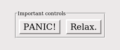
Here is an example of a LabelFrame widget
containing two Button widgets. Note that
the label “Important controls” interrupts the
border. This widget illustrates the default GROOVE relief (see Section 5.6, “Relief styles”) and
the default 'nw' label anchor, which
positions the label at the left side of the top of the
frame.
To create a new LabelFrame widget inside a
root window or frame parent
w= tk.LabelFrame(parent,option, ...)
This constructor returns the new LabelFrame
widget. Options:
Table 21. LabelFrame widget options
bg or background
| The background color to be displayed inside the widget; see Section 5.3, “Colors”. |
bd or borderwidth
| Width of the border drawn around the perimeter of the widget; see Section 5.1, “Dimensions”. The default value is two pixels. |
cursor
| Selects the cursor that appears when the mouse is over the widget; see Section 5.8, “Cursors”. |
fg or foreground
| Color to be used for the label text. |
height
|
The vertical dimension of the new frame. This will be
ignored unless you also call .grid_propagate(0) on the frame; see Section 4.2, “Other grid management methods”.
|
highlightbackground
| Color of the focus highlight when the widget does not have focus. |
highlightcolor | The color of the focus highlight when the widget has focus. |
highlightthickness
| Thickness of the focus highlight. |
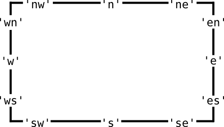
labelanchor
|
Use this option to specify the position of the
label on the widget's border. The default
position is  |
labelwidget
|
Instead of a text label, you can use any widget as
the label by passing that widget as the value of
this option. If you supply both labelwidget and text
options, the text option is ignored.
|
padx
| Use this option to add additional padding inside the left and right sides of the widget's frame. The value is in pixels. |
pady
| Use this option to add additional padding inside the top and bottom of the widget's frame. The value is in pixels. |
relief
|
This option controls the appearance of the border
around the outside of the widget. The default
style is tk.GROOVE; for other values,
see Section 5.6, “Relief styles”.
|
takefocus
|
Normally, the widget will not receive focus; supply
a True value to this option to make
the widget part of the focus traversal sequence.
For more information, see Section 53, “Focus: routing keyboard input”.
|
text
| Text of the label. |
width
|
The horizontal dimension of the new frame. This will be
ignored unless you also call .grid_propagate(0) on the frame; see Section 4.2, “Other grid management methods”.
|