Tkinter 8.5 reference: a GUI for Python |  |
Tkinter 8.5 reference: a GUI for Python | |
A number of widgets, such as listboxes and canvases, can act like sliding windows into a larger virtual area. You can connect scrollbar widgets to them to give the user a way to slide the view around relative to the contents. Here's a screen shot of an entry widget with an associated scrollbar widget:
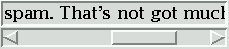
Scrollbars can be horizontal, like the one shown above, or vertical. A widget that has two scrollable dimensions, such as a canvas or listbox, can have both a horizontal and a vertical scrollbar.
The slider, or scroll thumb, is the raised-looking rectangle that shows the current scroll position.
The two triangular arrowheads at
each end are used for moving the position by small
steps. The one on the left or top is called arrow1, and the one on the right or bottom is
called arrow2.
The trough is the sunken-looking
area visible behind the arrowheads and slider. The
trough is divided into two areas named trough1 (above or to the left of the slider)
and trough2 (below or to the right of
the slider).
The slider's size and position, relative to the length of the entire widget, show the size and position of the view relative to its total size. For example, if a vertical scrollbar is associated with a listbox, and its slider extends from 50% to 75% of the height of the scrollbar, that means that the visible part of the listbox shows that portion of the overall list starting at the halfway mark and ending at the three-quarter mark.
In a horizontal scrollbar, clicking B1 (button 1) on the left arrowhead moves the view by a small amount to the left. Clicking B1 on the right arrowhead moves the view by that amount to the right. For a vertical scrollbar, clicking the upward- and downward-pointing arrowheads moves the view small amounts up or down. Refer to the discussion of the associated widget to find out the exact amount that these actions move the view.
The user can drag the slider with B1 or B2 (the middle button) to move the view.
For a horizontal scrollbar, clicking B1 in the trough to the left of the slider moves the view left by a page, and clicking B1 in the trough to the right of the slider moves the view a page to the right. For a vertical scrollbar, the corresponding actions move the view a page up or down.
Clicking B2 anywhere along the trough moves the slider so that its left or top end is at the mouse, or as close to it as possible.
The normalized position of the scrollbar refers to a number in the closed interval [0.0, 1.0] that defines the slider's position. For vertical scrollbars, position 0.0 is at the top and 1.0 at the bottom; for horizontal scrollbars, position 0.0 is at the left end and 1.0 at the right.
To create a new Scrollbar widget as the
child of a root window or frame parent
w= tk.Scrollbar(parent,option, ...)
The constructor returns the new Scrollbar
widget. Options for scrollbars include:
Table 31. Scrollbar widget options
activebackground
| The color of the slider and arrowheads when the mouse is over them. See Section 5.3, “Colors”. |
activerelief
|
By default, the slider is shown with the tk.RAISED relief style. To display the
slider with a different relief style when the mouse is over the
slider.
|
bg or background
| The color of the slider and arrowheads when the mouse is not over them. |
bd or borderwidth
| The width of the 3-d borders around the entire perimeter of the trough, and also the width of the 3-d effects on the arrowheads and slider. Default is no border around the trough, and a two-pixel border around the arrowheads and slider. For possible values, see Section 5.1, “Dimensions”. |
command
|
A procedure to be called whenever the scrollbar is
moved. For a discussion of the calling sequence,
see Section 22.1, “The Scrollbar callback”.
|
cursor
| The cursor that appears when the mouse is over the scrollbar. See Section 5.8, “Cursors”. |
elementborderwidth
|
The width of the borders around the arrowheads and
slider. The default is elementborderwidth=-1, which means to use
the value of the borderwidth option.
|
highlightbackground
| The color of the focus highlight when the scrollbar does not have focus. See Section 53, “Focus: routing keyboard input”. |
highlightcolor
| The color of the focus highlight when the scrollbar has the focus. |
highlightthickness
|
The thickness of the focus highlight. Default is
1. Set to 0 to
suppress display of the focus highlight.
|
jump
|
This option controls what happens when a user drags
the slider. Normally (jump=0),
every small drag of the slider causes the command callback to be called. If you set
this option to 1, the callback isn't
called until the user releases the mouse button.
|
orient
|
Set orient=tk.HORIZONTAL for a
horizontal scrollbar, orient=tk.VERTICAL for a vertical one (the default orientation).
|
relief
|
Controls the relief
style of the widget; the default style is
tk.SUNKEN. This option has no effect
in Windows.
|
repeatdelay
|
This option controls how long button 1 has to be
held down in the trough before the slider starts
moving in that direction repeatedly. Default is
repeatdelay=300, and the units are
milliseconds.
|
repeatinterval
|
This option controls how often slider movement will
repeat when button 1 is held down in the trough.
Default is repeatinterval=100, and
the units are milliseconds.
|
takefocus
|
Normally, you can tab the focus through a scrollbar
widget; see Section 53, “Focus: routing keyboard input”. Set takefocus=0 if you don't want this
behavior. The default key bindings for scrollbars
allow the user to use the ← and →
arrow keys to move horizontal scrollbars, and they
can use the ↑ and ↓ keys to move
vertical scrollbars.
|
troughcolor
| The color of the trough. |
width
| Width of the scrollbar (its y dimension if horizontal, and its x dimension if vertical). Default is 16. For possible values, see Section 5.1, “Dimensions”. |
Methods on scrollbar objects include:
.activate(element=None)
If no argument is provided, this method returns one
of the strings 'arrow1', 'arrow2', 'slider', or '', depending on where the mouse is. For
example, the method returns 'slider'
if the mouse is on the slider. The empty string is
returned if the mouse is not currently on any of these
three controls.
To highlight one of the controls (using its activerelief relief style and its activebackground color), call this method
and pass a string identifying the control you want to
highlight, one of 'arrow1', 'arrow2', or 'slider'.
.delta(dx, dy)
Given a mouse movement of ( in pixels, this method returns the dx, dy)float
value that should be added to the current slider position
to achieve that same movement. The value must be in the
closed interval [-1.0, 1.0].
.fraction(x,
          y)
Given a pixel location (, this method returns the corresponding
normalized slider position in the interval [0.0, 1.0]
that is closest to that location.
x, y)
.get()
Returns two numbers (abab
.identify(x,
          y)
This method returns a string indicating which (if
any) of the components of the scrollbar are under the
given ( coordinates.
The return value is one of x,
y)'arrow1',
'trough1', 'slider',
'trough2', 'arrow2', or
the empty string '' if that location
is not on any of the scrollbar components.
.set(first,
          last)
To connect a scrollbar to another widget wwxscrollcommand or yscrollcommand to the scrollbar's .set method. The arguments have the same
meaning as the values returned by the .get() method. Please note that moving the
scrollbar's slider does not move
the corresponding widget.