Tkinter 8.5 reference: a GUI for Python |  |
Tkinter 8.5 reference: a GUI for Python | |
The purpose of a scale widget is to allow the user to set some
int or float value within a
specified range. Here are two scale widgets, one horizontal and
one vertical:
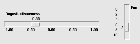
Each scale displays a slider that the user can drag along a trough to change the value. In the figure, the first slider is currently at -0.38 and the second at 7.
You can drag the slider to a new value with mouse button 1.
If you click button 1 in the trough, the slider will move one increment in that direction per click. Holding down button 1 in the trough will, after a delay, start to auto-repeat its function.
If the scale has keyboard focus, left arrow and up arrow keystrokes will move the slider up (for vertical scales) or left (for horizontal scales). Right arrow and down arrow keystrokes will move the slider down or to the right.
To create a new scale widget as the child of a root window
or frame named parent
w= tk.Scale(parent,option, ...)
The constructor returns the new Scale
widget. Options:
Table 30. Scale widget options
activebackground
| The color of the slider when the mouse is over it. See Section 5.3, “Colors”. |
bg or background
| The background color of the parts of the widget that are outside the trough. |
bd or borderwidth
| Width of the 3-d border around the trough and slider. Default is two pixels. For acceptable values, see Section 5.1, “Dimensions”. |
command
| A procedure to be called every time the slider is moved. This procedure will be passed one argument, the new scale value. If the slider is moved rapidly, you may not get a callback for every possible position, but you'll certainly get a callback when it settles. |
cursor
| The cursor that appears when the mouse is over the scale. See Section 5.8, “Cursors”. |
digits
|
The way your program reads the current value shown in a
scale widget is through a control variable; see Section 52, “Control variables: the values behind the widgets”. The control variable for
a scale can be an IntVar, a DoubleVar (for type float), or a
StringVar. If it is a string variable,
the digits option controls how many
digits to use when the numeric scale value is converted
to a string.
|
font
| The font used for the label and annotations. See Section 5.4, “Type fonts”. |
fg or foreground
| The color of the text used for the label and annotations. |
from_
|
A float value that defines one end of the
scale's range. For vertical scales, this is the top
end; for horizontal scales, the left end. The underbar
(_) is not a typo: because from is a reserved word in Python, this option
is spelled from_. The default is 0.0.
See the to option, below, for the other
end of the range.
|
highlightbackground
| The color of the focus highlight when the scale does not have focus. See Section 53, “Focus: routing keyboard input”. |
highlightcolor
| The color of the focus highlight when the scale has the focus. |
highlightthickness
|
The thickness of the focus
highlight. Default is 1. Set highlightthickness=0 to suppress display
of the focus highlight.
|
label
| You can display a label within the scale widget by setting this option to the label's text. The label appears in the top left corner if the scale is horizontal, or the top right corner if vertical. The default is no label. |
length
| The length of the scale widget. This is the x dimension if the scale is horizontal, or the y dimension if vertical. The default is 100 pixels. For allowable values, see Section 5.1, “Dimensions”. |
orient
|
Set orient=tk.HORIZONTAL if you want the
scale to run along the x
dimension, or orient=tk.VERTICAL to run
parallel to the y-axis.
Default is vertical.
|
relief
|
With the default relief=tk.FLAT, the
scale does not stand out from its background. You
may also use relief=tk.SOLID to get a
solid black frame around the scale, or any of the
other relief types described in Section 5.6, “Relief styles”.
|
repeatdelay
|
This option controls how long button 1 has to be
held down in the trough before the slider starts
moving in that direction repeatedly. Default is
repeatdelay=300, and the units are
milliseconds.
|
repeatinterval
|
This option controls how often the slider jumps
once button 1 has been held down in the trough for
at least repeatdelay milliseconds.
For example, repeatinterval=100
would jump the slider every 100 milliseconds.
|
resolution
|
Normally, the user will only be able to change the
scale in whole units. Set this option to some
other value to change the smallest increment of the
scale's value. For example, if from_=-1.0 and to=1.0, and
you set resolution=0.5, the scale
will have 5 possible values: -1.0, -0.5, 0.0, +0.5,
and +1.0. All smaller movements will be ignored.
Use resolution=-1 to disable any
rounding of values.
|
showvalue
| Normally, the current value of the scale is displayed in text form by the slider (above it for horizontal scales, to the left for vertical scales). Set this option to 0 to suppress that label. |
sliderlength
|
Normally the slider is 30 pixels along the length
of the scale. You can change that length by
setting the sliderlength option to
your desired length; see Section 5.1, “Dimensions”.
|
sliderrelief
|
By default, the slider is displayed with a tk.RAISED relief style. For other relief
styles, set this option to any of the values
described in Section 5.6, “Relief styles”.
|
state
|
Normally, scale widgets respond to mouse events,
and when they have the focus, also keyboard events.
Set state=tk.DISABLED to make the
widget unresponsive.
|
takefocus
| Normally, the focus will cycle through scale widgets. Set this option to 0 if you don't want this behavior. See Section 53, “Focus: routing keyboard input”. |
tickinterval
|
Normally, no “ticks” are displayed
along the scale. To display periodic scale values,
set this option to a number, and ticks will be
displayed on multiples of that value. For example,
if from_=0.0, to=1.0,
and tickinterval=0.25, labels will
be displayed along the scale at values 0.0, 0.25,
0.50, 0.75, and 1.00. These labels appear below
the scale if horizontal, to its left if vertical.
Default is 0, which suppresses display of ticks.
|
to
|
A float value that defines one end of the
scale's range; the other end is defined by the from_ option, discussed above. The to value can be either greater than or less
than the from_ value. For vertical
scales, the to value defines the bottom
of the scale; for horizontal scales, the right end. The
default value is 100.0.
|
troughcolor
| The color of the trough. |
variable
|
The control variable for this scale, if any; see Section 52, “Control variables: the values behind the widgets”. Control variables may be
from class IntVar, DoubleVar (for type float), or StringVar. In the latter case, the numerical
value will be converted to a string. See the the digits option, above, for more information on
this conversion.
|
width
|
The width of the trough part of the widget. This
is the x dimension for vertical scales and the y
dimension if the scale has orient=tk.HORIZONTAL. Default is 15 pixels.
|
Scale objects have these methods:
.coords(value=None)
Returns the coordinates, relative to the upper left
corner of the widget, corresponding to a given value
of the scale. For value=None, you get
the coordinates of the center of the slider at its
current position. To find where the slider would be
if the scale's value were set to some value xvalue=.
x
.get()
This method returns the current value of the scale.
.identify(x,
          y)
Given a pair of coordinates ( relative to the top left corner of the
widget, this method returns a string identifying what
functional part of the widget is at that location.
The return value may be any of these:
x, y)
'slider' | The slider. |
'trough1'
| For horizontal scales, to the left of the slider; for vertical scales, above the slider. |
'trough2'
| For horizontal scales, to the right of the slider; for vertical scales, below the slider. |
''
|
Position ( is
not on any of the above parts.
|
.set(value)
Sets the scale's value.